THE SUMMIT CENTER BUILDING HOPE CAPITAL CAMPAIGN
Campaign Branding, Print Work
*Agency Project Completed at Manzella Marketing
The Summit Center Building Hope Capital Campaign was the very first project I ever worked on after first joining Manzella in early 2016. They had a lot of work and limited people and resources to complete the work for this large project at that time. After seeing the work I had done in my post-college portfolio, they trusted me and guided me in the major task of coming up with the artwork for this campaign.
The Summit Center, a company that works with Autistic children and young adults, came to Manzella in need of a campaign to fundraise money for renovating different locations in order to expand their services and work with more people and families in need. They wanted to call this campaign “Building Hope”, and after not being able to come up with much in terms of artwork with their own designer, we took over the project at Manzella and started from scratch.
We began with a logo to brand the campaign, incorporating the existing logo of The Summit Center. After I did some initial mockups of possibilities for the campaign logo, the Creative Director and I decided on a design I had created that was simple and text based, with colors that reflected their main logo. I incorporated the rich pink, green, blue and yellow of their logo and included them in the word “hope” to attract viewers to that particular word. Summit’s campaign is based on hope for the future of the people they work with and will potentially work with, and they thought the idea behind the final logo worked well.
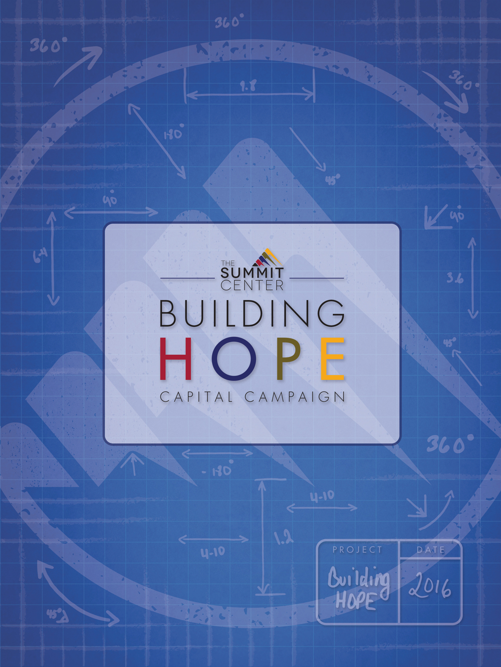
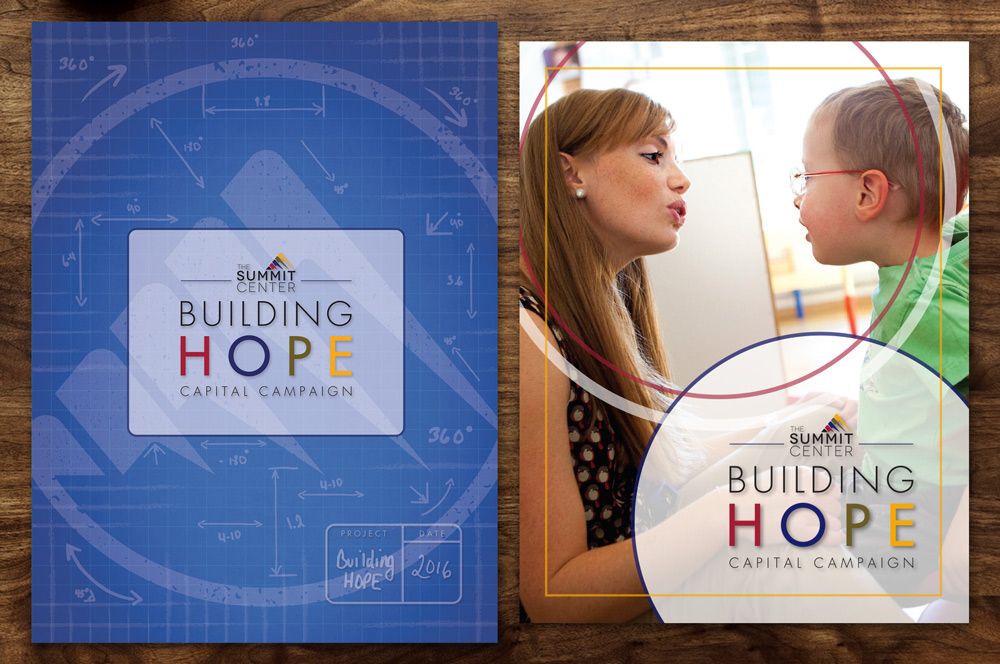
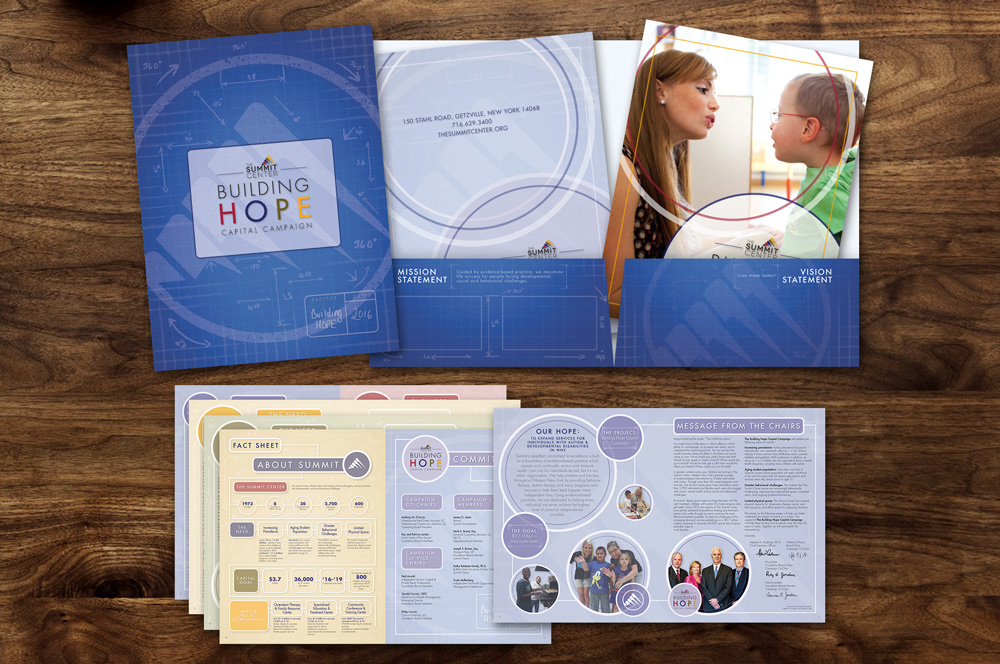
The idea of the campaign was to have something tangible to send out to potential donors. After the initial meeting with the client, we knew we needed to produce a folder to hold the campaign items, a large brochure demonstrating the need for the money and renovations, and other supporting collateral materials. I started with the layout of the folder. The title, “Building Hope,” made me think of a blueprint. In the design, I went for what people majorly think of when they think of the word “blueprint.” Not the actual white paper with drawing on it that architects use, but blue paper with white writing on it. I felt that the rich blue was a good compliment to the bright colors in the logo which is placed in the middle of the folder. I created some hand drawn measurement elements surrounding a background wash of their logo symbol, enforcing the idea of building hope at summit. A project box in the bottom right hand corner with the name of the campaign and date was added in to tie the blueprint concept together.
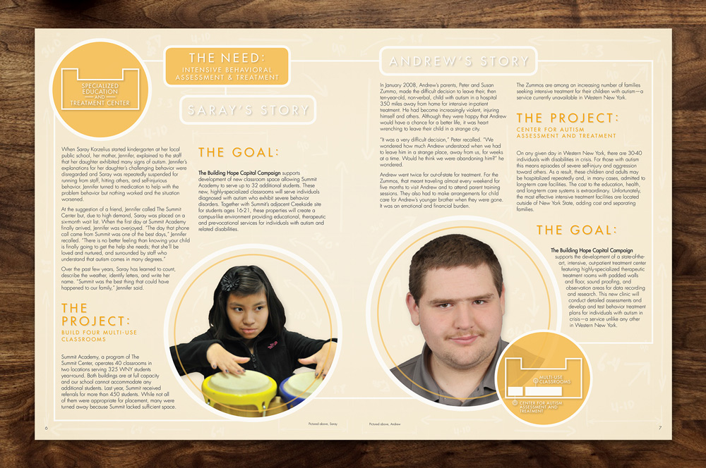
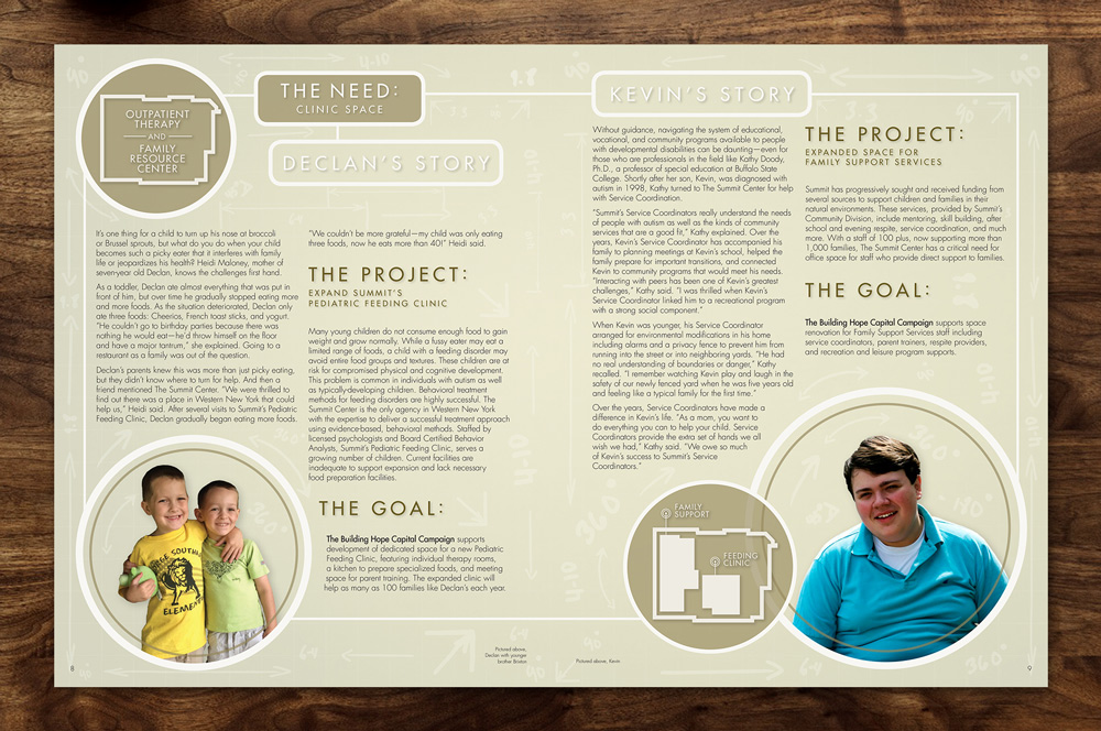
Moving on to the campaign’s brochure, I wanted to reflect some of the stylistic elements featured on the folder. For the cover, the Creative Director and I decided that the design should primarily feature a photo, as something too graphic might fight too much with the folder design. I added in some border and circular elements that I had started on the folder to tie it to the overall design without going over the top graphically. The inside spreads of the brochure feature the blueprint idea once again. Blue, pink, green and gold are used as colors of the blueprints within the brochure, again reflecting the colors in the logo. Circles, borders and more hand-drawn measurement elements are used in the design to give it a feeling of something being built as you read the stories of clients Summit has helped within the brochure.
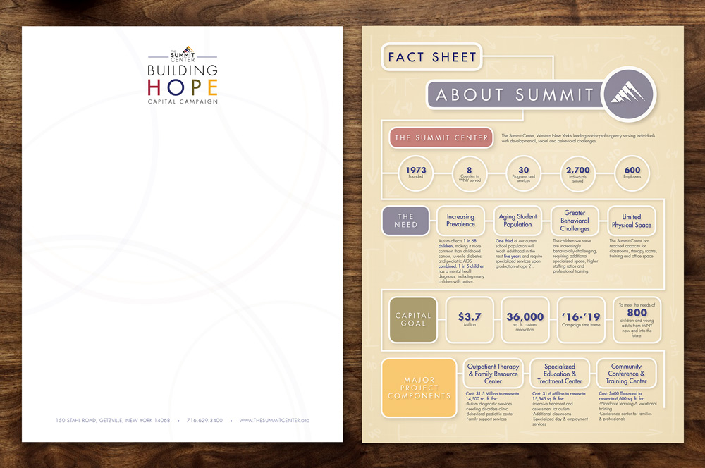
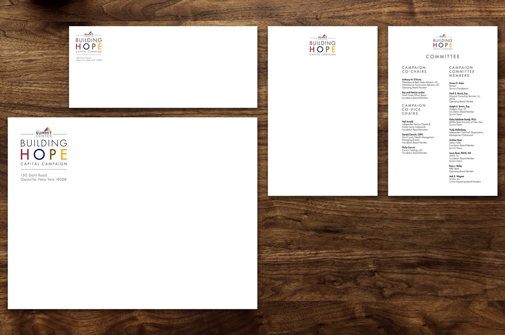
Lastly for the collateral materials, first Summit wanted a fun infographic to quickly show information on people they’ve helped, why they need funding, their goals and also different project components. For this graphic I incorporated more geometric elements resembling a blueprint layout that lead your eye through the infographic to the end. This was featured as a standalone piece and also as a page within the brochure. I laid out simple stationary, with a letterhead featuring a wash of the circular design elements used in the other pieces. I also designed a notepad and envelopes more simple and clean as a contrast to the heavy graphic imagery that potential donors would be receiving.
Overall this project was challenging, fun and extremely rewarding to work on. I was so thrilled that the Creative Director and Account Executive at Manzella trusted me to complete this major project with results that they and the client were very pleased with. This campaign was a wonderful group effort between us at Manzella and the client, and featured a wonderful workflow and creativity between us both to attain the best results possible.