Camp Turner Centennial Campaign
Campaign, Logo Design, Illustration, Print
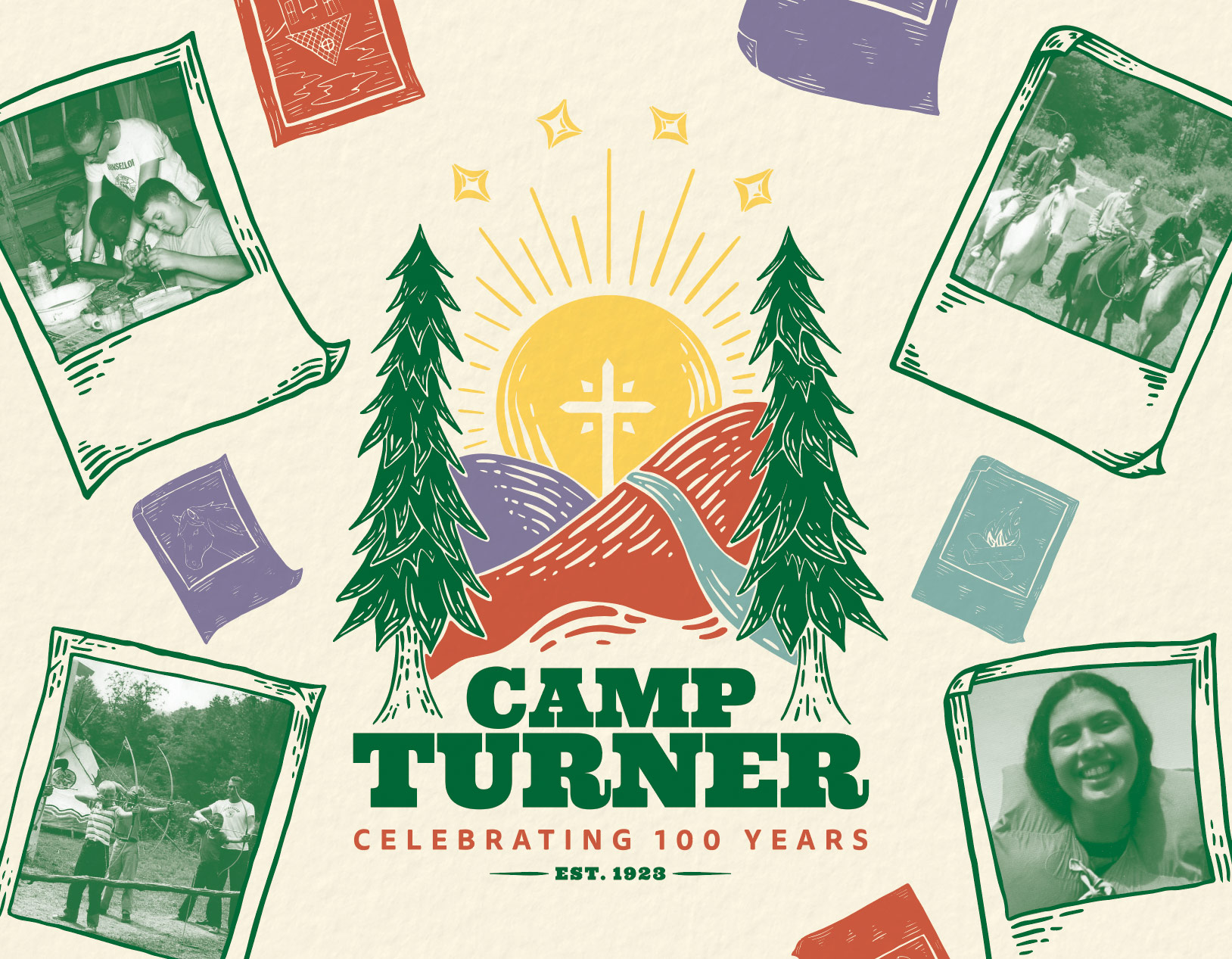
Self-confidence, discovery of nature, and lasting friendships are life experiences so many kids have acquired over the past 100 years of Camp Turner’s existence. Summer camp is such a landmark in the childhood of many individuals, and an institution that’s been around for years is just the place to expertly foster and create those lasting memories.
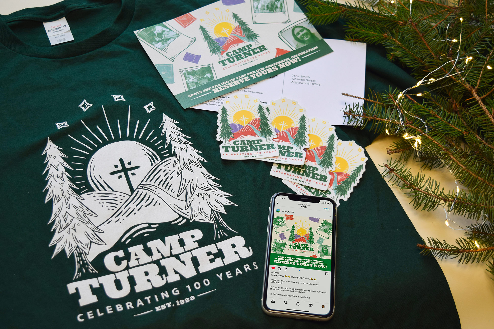
Camp Turner celebrated their centennial in the summer of 2023, and they came to the OLV Charities creative team looking for special branding to commemorate their planned celebration. A fresh logo and a fun look blown across all channels were pivotal to get the word out and encourage alumni to take part in their event surrounding the celebration.
Below, you’ll see the creative process and components that came together to help make this centennial event a success—with great attendance and alumni donations to ensure that Camp Turner is around for another 100 years.
Creative Process
I started out gathering ideas for this logo by researching fun camp imagery, styles, and designs. Finding things that I was inspired by, I started out with some very rough sketches to try and solidify my thoughts more. Camp Turner’s standard logo features the camp’s iconic hills, cross, pine trees, and four stars. I thought that taking their logo, and doing a more bright, retro, illustrated graphic could be a good route to go in really pushing that celebratory vibe of 100 years passed. I drew out a bunch of ideas on my iPad, and then solidified four look directions. I took these inky-looking graphics I had drawn out in black and white, cleaned them up in Adobe Illustrator, and then proceeded to colorize and figure out type solutions for each. The four final logos that were presented to the client are featured below.
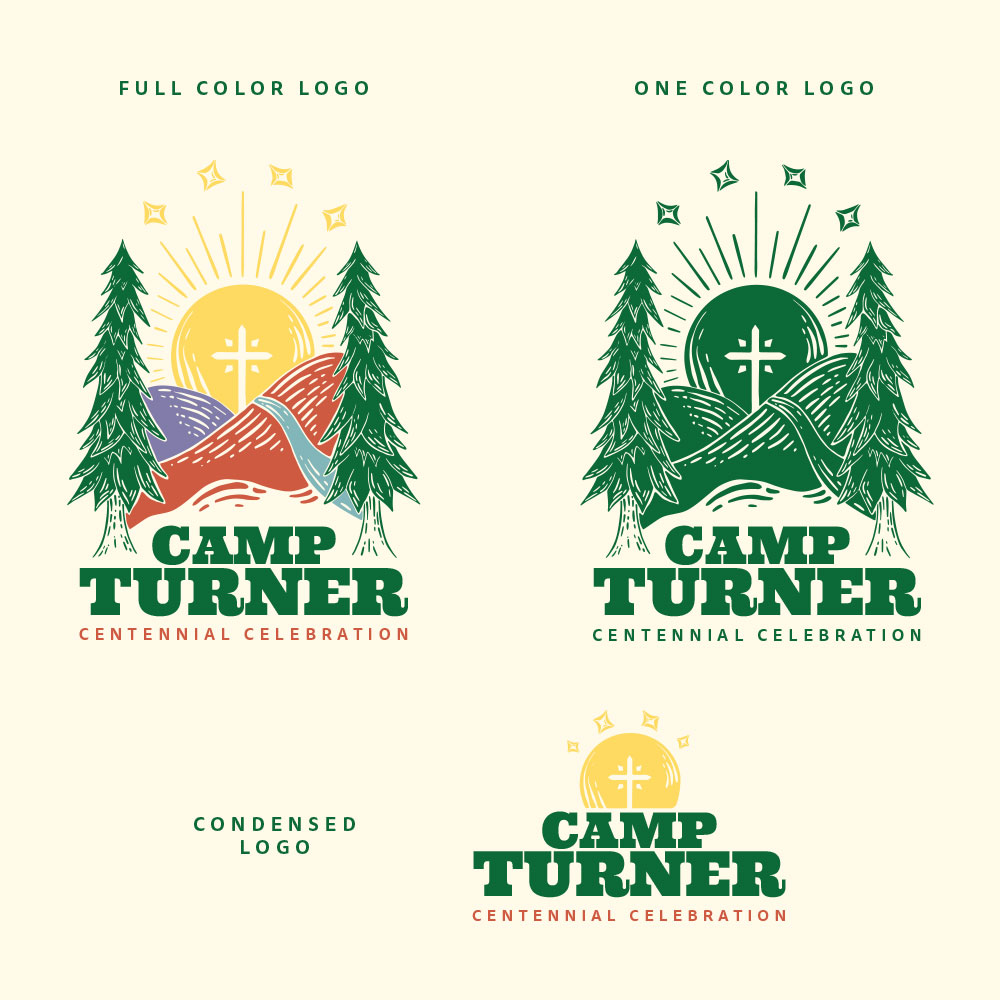
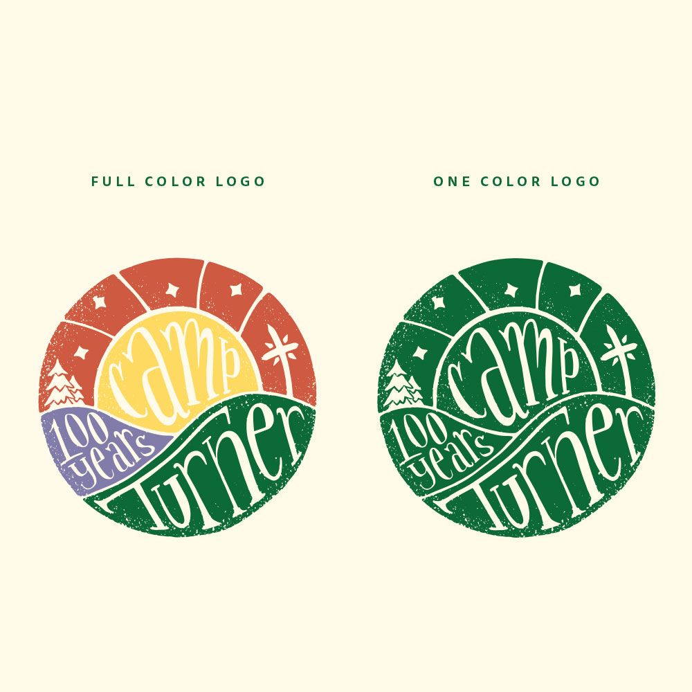
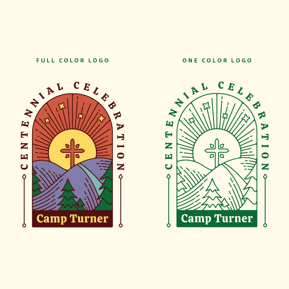
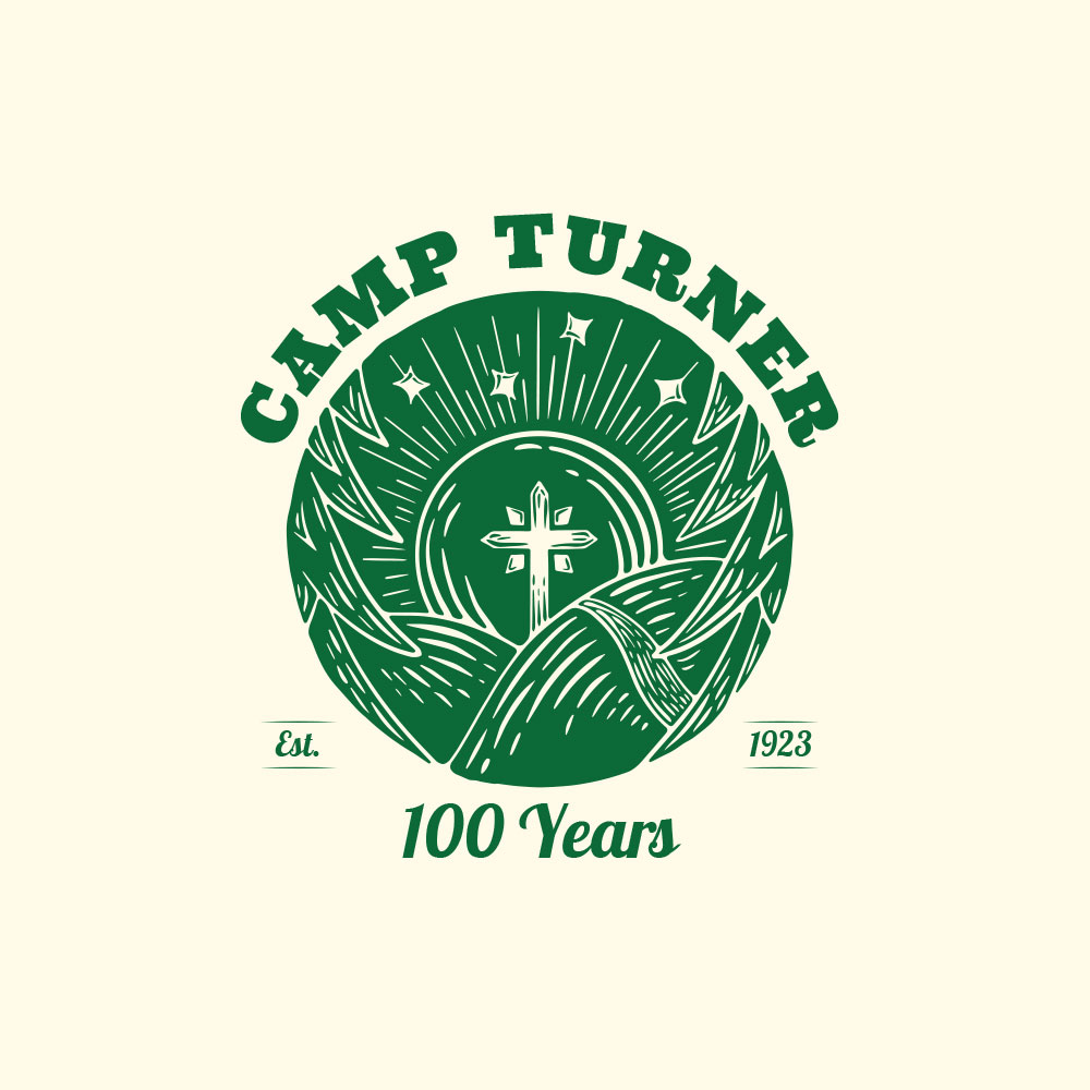
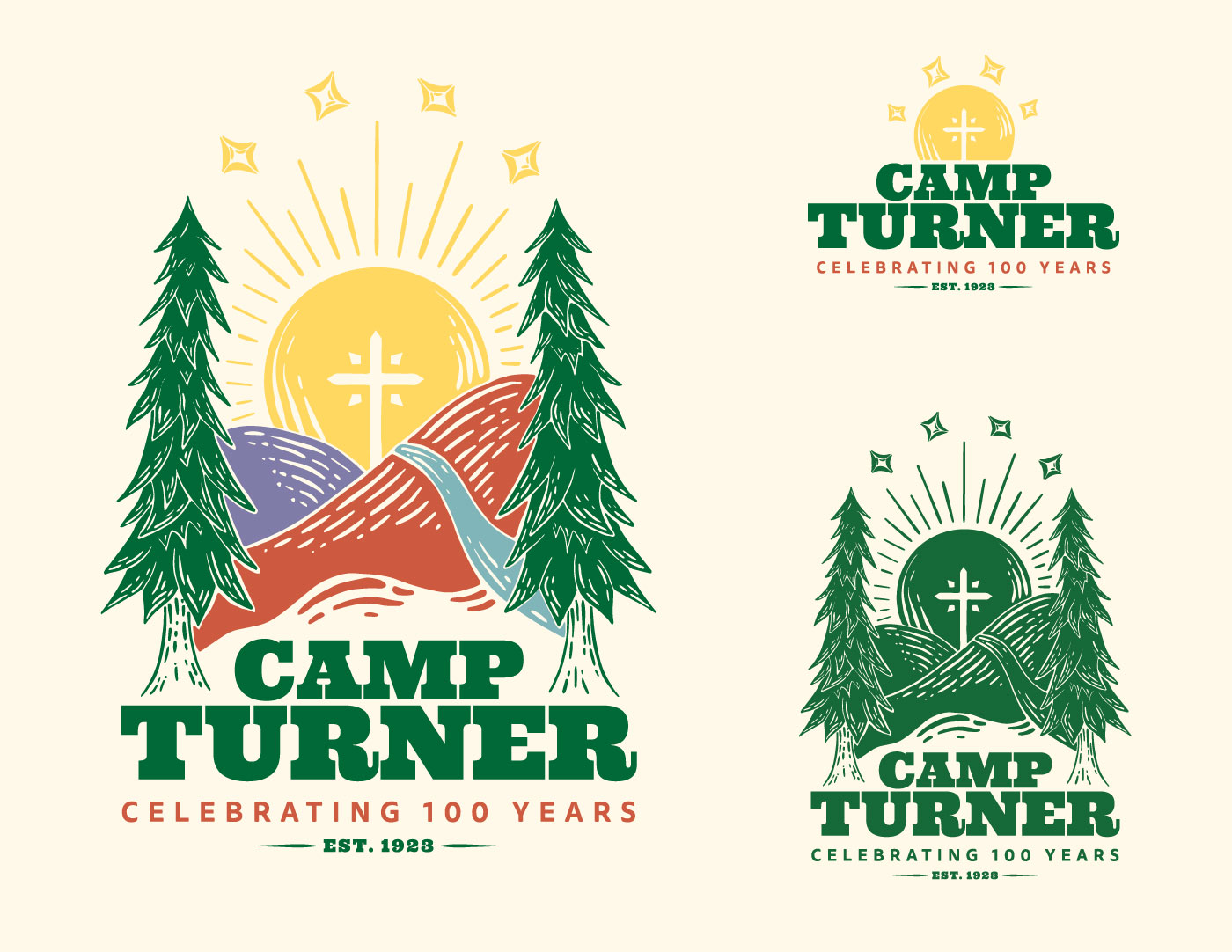
These got a great reception from the stakeholders, and ultimately, they ended up going with the first concept from above. After a title change-up and some finalization, you have the logo below as Camp Turner’s official centennial logo. It features a full color, full design option, and then a condensed version for use in smaller areas.
The Campaign
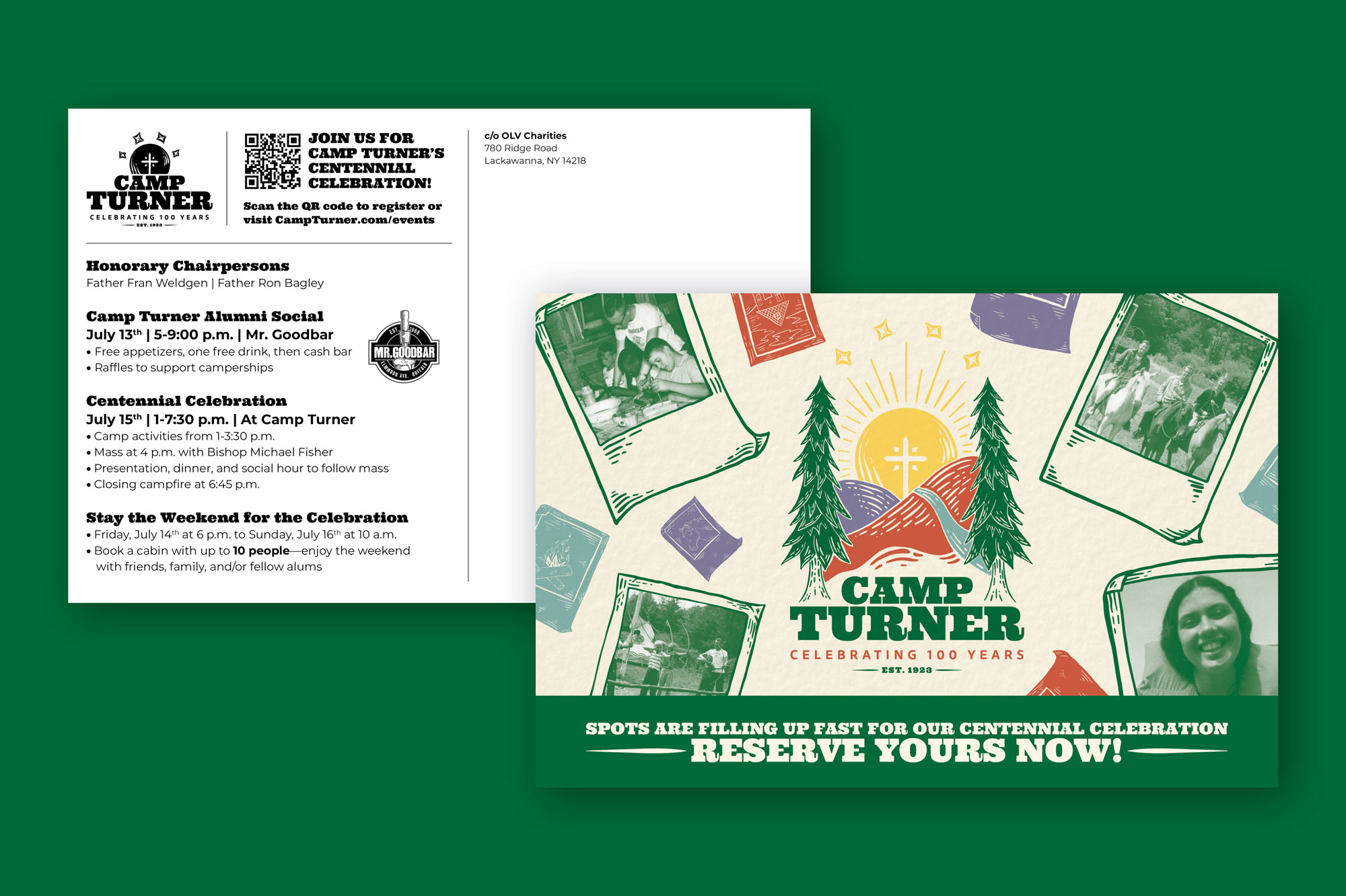
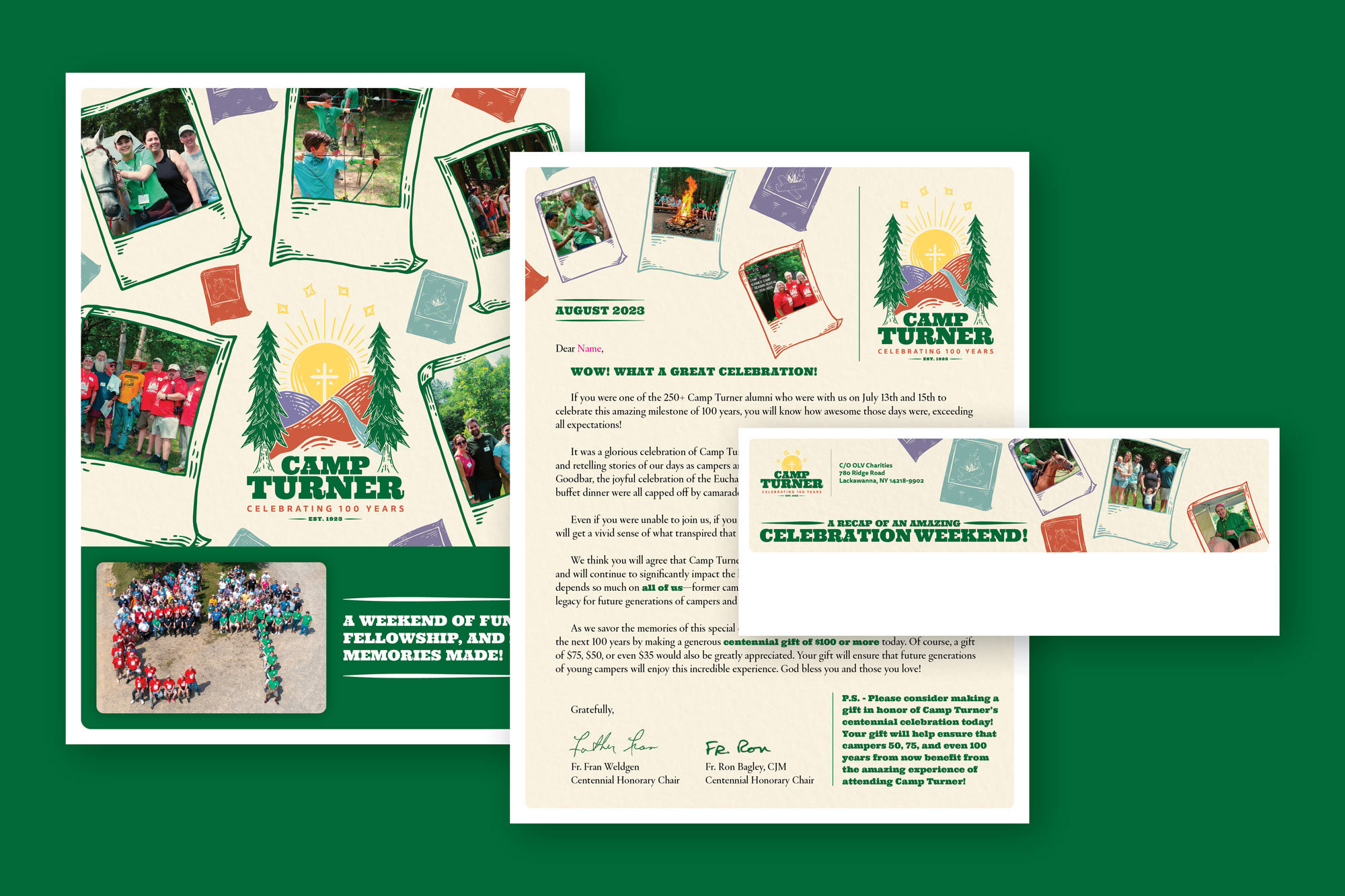
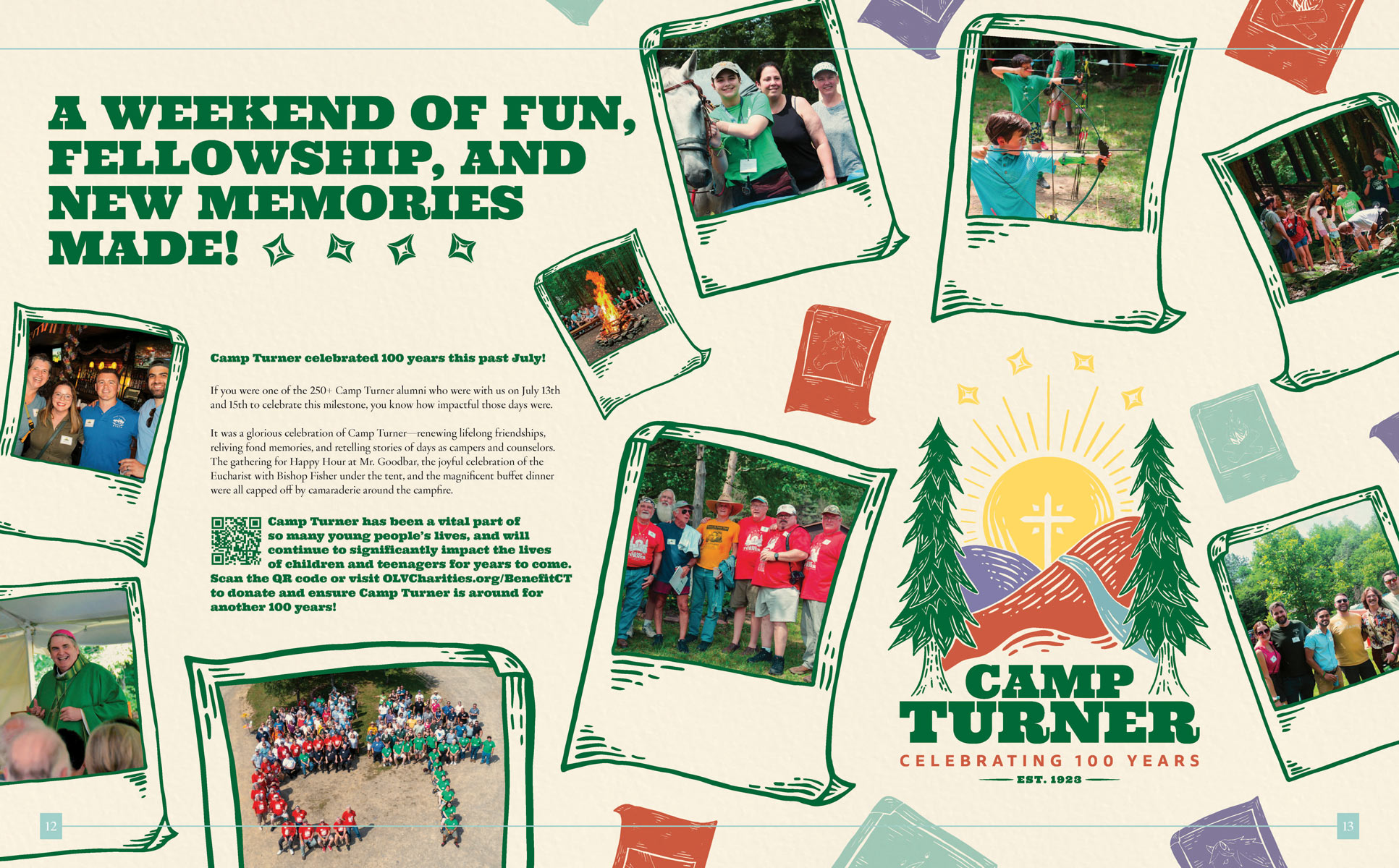
Once a logo and overall feel was established, it was time to get word of this event out there into print and digital spaces. I created some additional illustrations to be used as design elements throughout postcards, social posts, and emails, and incorporated some old camper imagery as well to push the retro feel of the campaign. We wanted the fun and inviting logo to be the star to grab people’s attention and show alumni how fun this event would be. The result was an extremely well-attended weekend-long event with new, lasting memories made, as well as many donations to ensure the future of this wonderful camp. A recap was featured in OLV’s Fall 2023 issue of Centennial magazine.
