ANDERSON RENOVATIONS, LLC
Branding, Print Work, Freelance Work
Anderson Renovations, LLC is a small home renovation company based in Buffalo, NY. They came to me in mid-2018 looking for a unique logo to represent them to their rapidly-growing client base. They wanted something fun, illustrative and graphic. They also knew that they liked the idea of incorporating some construction tools if it could be done in a non-cheesy manner. They had seen my personal “woodcut” illustration style and said that they would love a logo design done in that style.
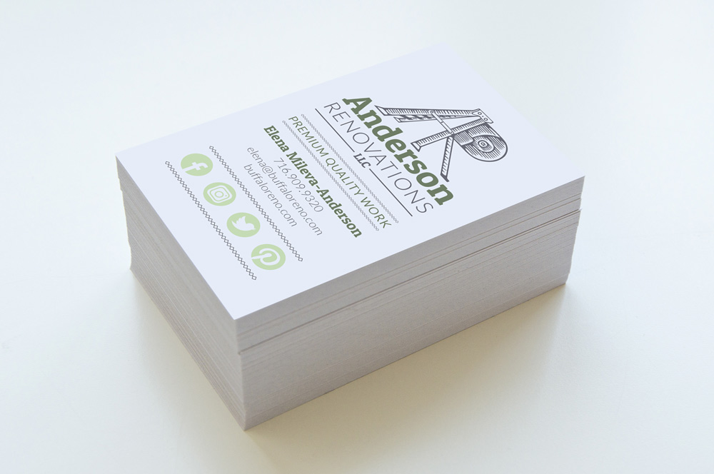
I saw this direction as a fun challenge and went about coming up with a few concepts that would fit this. I sketched out the logo idea you see here with a couple others, and they loved this particular concept using a ladder and measuring tape to create the letters “A” and “R” after the name of their company. To finalize this logo, I drew out the ladder and measuring tape image using marker and then took the design and vectorized it in Adobe Illustrator. A deep green and grey were used in the design as a contrast to the graphic intensity of the logo illustration and the playful Patua One serif font used in the word “Anderson.” A sturdier san serif font was used in the word “Renovations” to ground the logo a bit more. The logo overall has a fun yet sturdy look to it with the stacked type supporting the logo image, and is something that represents their particular brand well.
They came to me for a business card design shortly after the logo was finalized, and I again went for a stacked look in the layout of their company information to compliment the branding of their logo. I incorporated a supporting light green color in some elements of the cards to give them more of a pop as well.