Victory Education
OLV Human Services’ Education Rebrand
The Problem
As a vast human services agency that helps people of all ages in the WNY community, OLV Human Services (OLVHS) offers a wide array of social, health, and education programs for the individuals in their care. And as you can imagine, being such a large agency, different programs develop, change, leave, or are introduced over the years. A big problem with this is that programs that fit under one branch of the agency can appear disjointed after a while, and develop their own brand or reputation with no one knowing that they’re supported by OLVHS.
This was OLVHS’ issue with their education branch of the agency. With seven different schools with seven different names and no tie back to the agency, you could drive past a school and rightfully think that it was just a random preschool, private school, or tied in with the local area’s school district. And with that view, how can you know that these are specialized schools, ran by OLV Human Services, that include learning styles that could help your child or loved one who may have a diagnosis that OLVHS specializes in treating?
The Solution – Victory Education
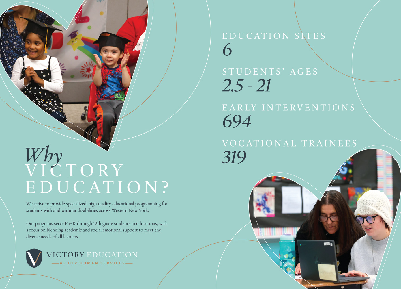
To address this issue, the OLVHS education team came to OLV Charities’ creative team and asked for our help. To start, we came up with one overarching name for all of OLVHS’ education programs, Victory Education. “Victory” not only ties into OLV’s name (Our Lady of Victory), but also reflects on the students that attend these schools. A wide array of children—ages 2.5 to 21—with a wide array of abilities are OLVHS’ students. Some come from healthy family backgrounds, but others come from more difficult family backgrounds. Some students have various mental illnesses, traumas, are diagnosed with ASD, have cognitive disabilities, or have combinations of the four. “Victory” for one individual can look like college after graduation, while for another it can look like being able to sustain a job and supporting themselves. For some, it’s being able to learn their triggers and work towards breaking harmful family cycles. And for others, it’s being able to make progress and develop in their own ways with their specific cognitive abilities. Whatever that “victory” is, OLVHS is here for them with trauma informed care to help individuals see those goals through.
Victory Education Logo
The Victory Education logo features a shield, reminiscent of old shield logos that various learning institutions have adopted. But it also points to a feeling of protection, help, and guidance, all of which OLVHS offers their students. And then a simple, stylized “V” features on the shield, as a nod to the name. The typeface type layout, and coloring follows the branding of OLV Human Services and their logo, to tie into the organization even more.
The Schools
The schools and their names jump off of Victory Education, with Victory Academy, Victory Early Childhood, and Victory Learning Center as the three main school names. All include the “V” from the Victory Education logo, and their own imagery, to tie into Victory Education while also playing up their individual features.
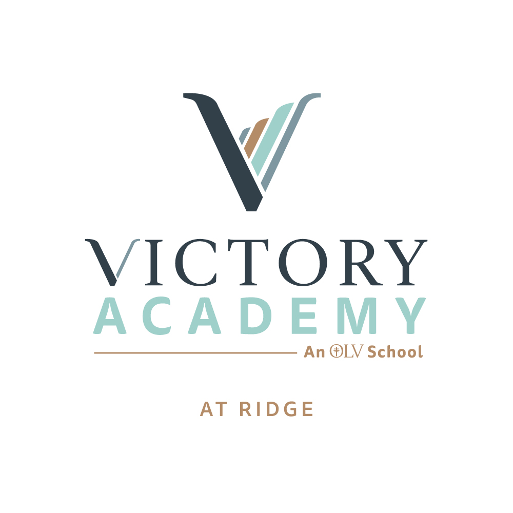
Victory Academy
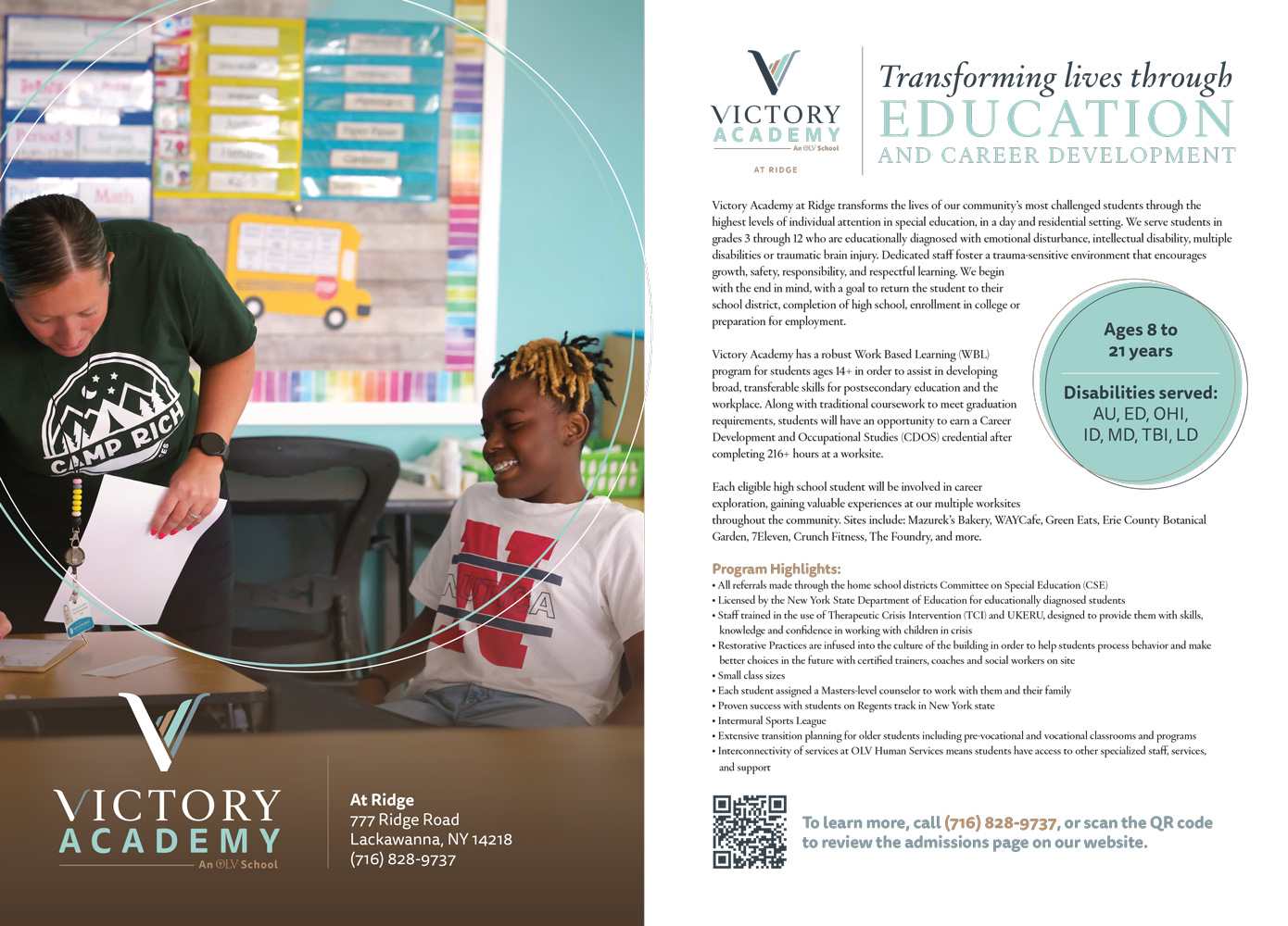
Three of OLVHS’s school-age locations, including the former Baker Hall school, all became Victory Academy, with their locations listed beneath each logo (at Ridge, Nelson, and St. John’s Parkside). Victory Academy students need trauma-informed care, help with various disabilities, and can partake in work study programs (for the older students) if they wish. Playing into the idea that victory looks different for everyone, a simplified, abstract depiction of ascending hills or mountains is portrayed in the “V” of this logo. It points to making progress and ending up where you need to as an individual.
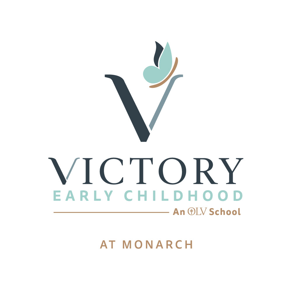
Victory Early Childhood
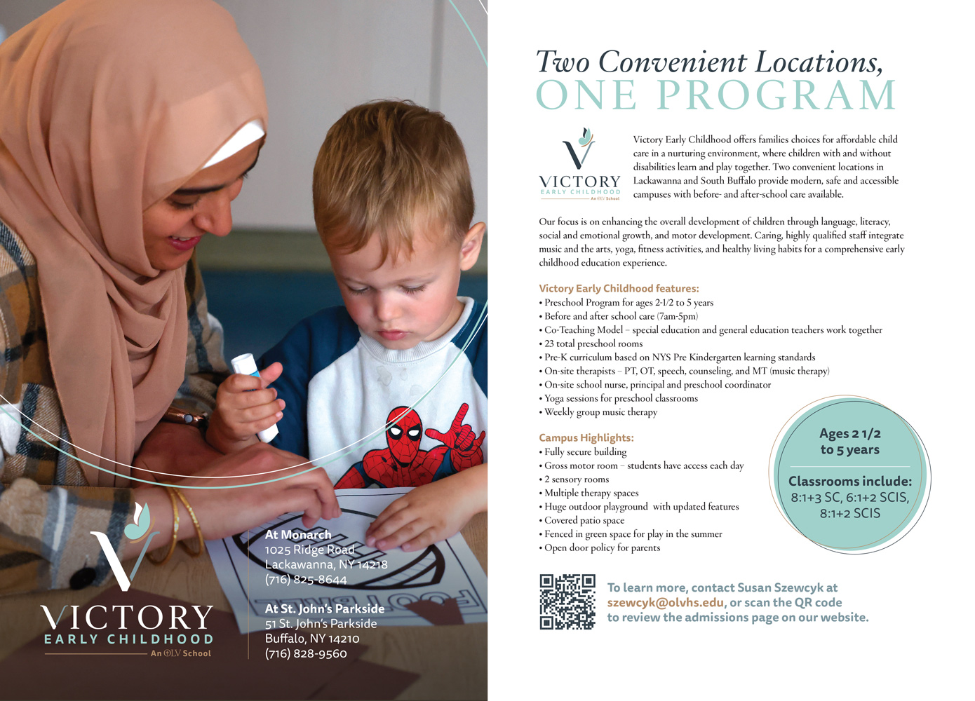
Monarch Little Learners and St. John’s Parkside Preschools both became Victory Early Childhood. Again, both locations appear below the logo depending on which location you’re talking about. The education people at OLVHS really liked the butterfly from the original Monarch logo with its playfulness. And it’s also a great nod to developing as a child, since butterflies start out as caterpillars and change when they’re ready. It’s a perfect metaphor for early childhood development, a crucial stage in human development overall, so we thought it would be the perfect addition to the “V” in this logo.
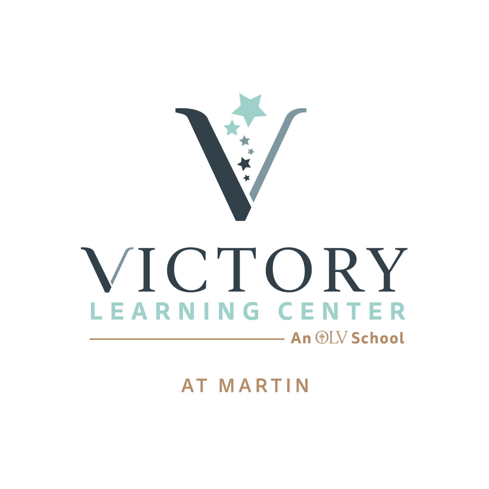
Victory Learning Center
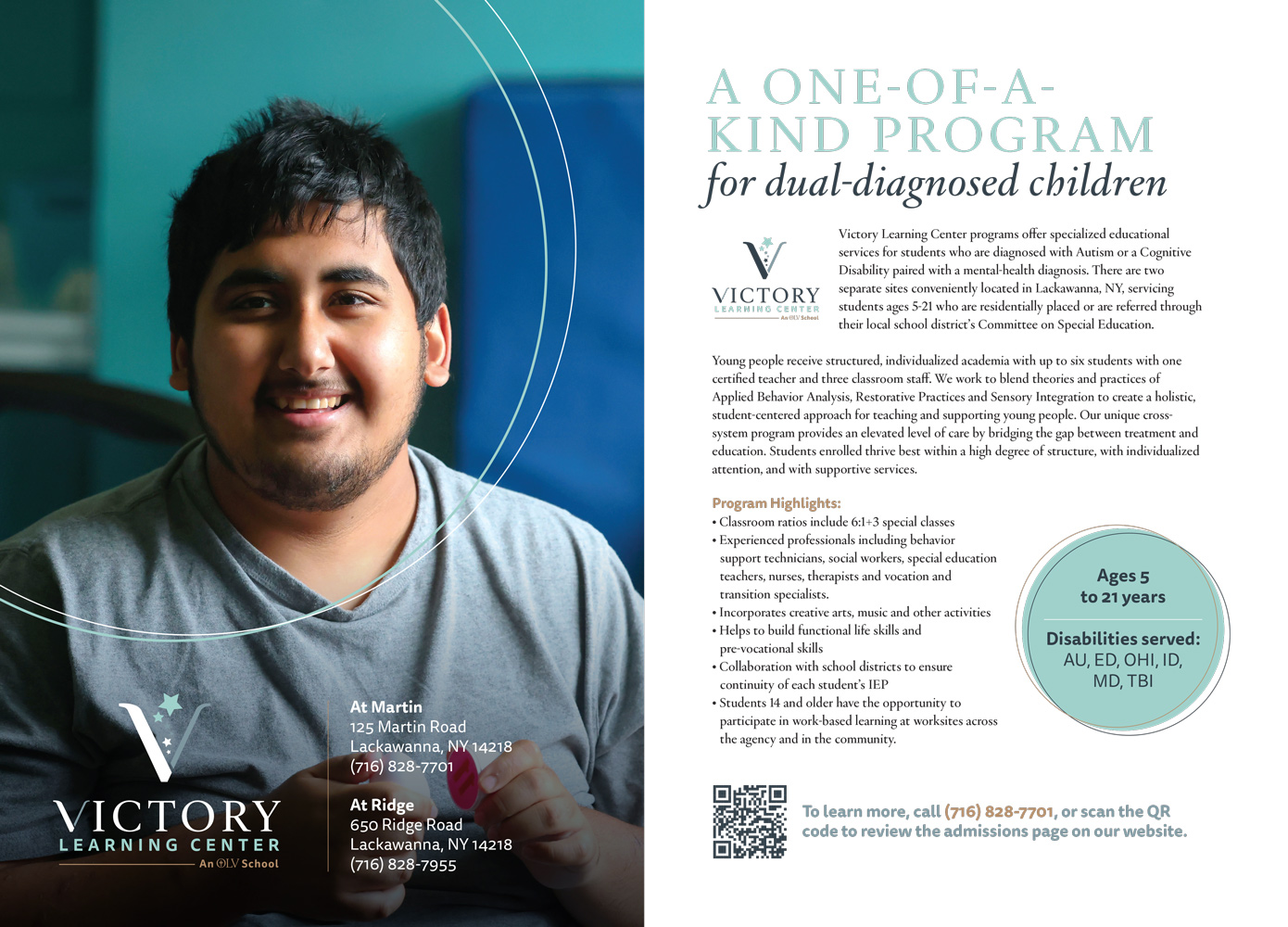
OLVHS’ Intensive Treatment Program (ITP) locations became Victory Learning Center. The ITP is a special program for students who are diagnosed with Autism or a Cognitive Disability, combined with a mental-health diagnosis (dual-diagnosed children). It gives students much needed structure, while bridging the gap between treatment and education. These are students that need a lot of attention and care, and this program can be a godsend for caregivers who need this help for their loved ones. For the logo of this school, we wanted something more hopeful, and OLVHS ended up being very drawn to this concept with ascending stars. It’s similar in messaging to the Victory Academy logo, with the progress and ascension message, but the stars are looser than the stylized mountains of Victory Academy. They’re different sizes, colors, and take different paths. It’s a small representation of what it means to progress, even with cognitive functioning that may hold you back from a more typical path forward. But progress is progress, and that’s what matters.
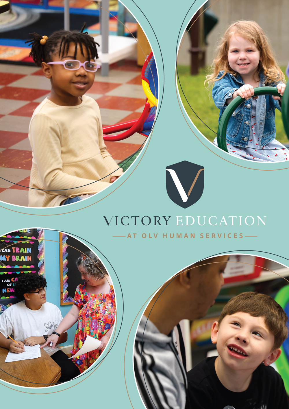
Brochure
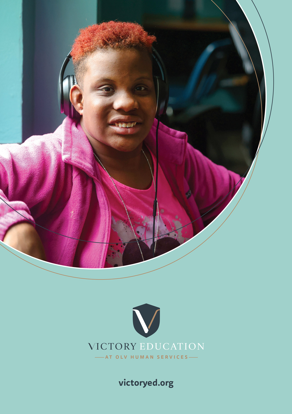
After the rebrand, another step was making sure that everything related to Victory Education, was as easily accessible to people as possible. So along with a Victory Education website, we also compiled and designed an overview brochure. It breaks down each school, and everything OLVHS has to offer education-wise. It’s the perfect overview for people who want or need to learn more about how Victory Education can help them.
Style-wise, the brochure keeps inline with OLVHS’s branding (see their Agency Overview Brochure for branding reference). Lots of organic shapes and circles are used, along with OLV coloring and type-styling. Natural photography of the students is used throughout the brochure to show them learning in the Victory Education environment.
Front and Back Cover
Selected Spreads